Sweet Treat Giveaway
As part of the UXUI daily challenge, one of the tasks was to create a signup page. In this case, the idea was for a treat basket giveaway.
Problem Statement
To create a sign up page as part of the daily UXUI challenge brief
Challenge
Creating a sign-in page with the following:
-
A form submission
-
Subject topic
-
General UXUI design

Low-fidelity wireframes
The initial idea was to have a signup page that contains everything on one page. This means users would just scroll through the page content. Free-flowing design elements and a colour scheme were introduced on the page to embody icing (Sweet Treat).
.jpg)
Low-fidelity wireframes
Following on from this, the relevant text titles and lorem ipsum were added to give a fuller picture of what the page would look like. The form was given its own section (Purple box) to alert users that it is a different part of the page. The images of the cookies helped to market the product being advertised.
.jpg)
Mid-fidelity wireframes
It was then decided that for better navigation for the users, having different pages may be more beneficial. This would allow users to travel on a gradual journey rather than cramming all the content on a very long page.
.jpg)
High-fidelity wireframes
For the final design, you can see that key sections have been grouped in purple boxes so certain content can emphasise the page. It also allows the design to come across as more modern and clean.
.jpg)
Alternative Colour Palette
In an experiment of colour scheme, a different colour palette was tested as seen below. When the comparison of the two designs was tested with users, the following was said:
-
Pink- Sweet, sugar, girly, valentines- strawberry and cream flavoured
-
Green- Healthier treats, natural, pistachio and nut flavoured
.jpg)
Mobile Prototype
Prototype Video
This video gives a general idea of how the sign up page would operate.
Style Guide
Style Guide
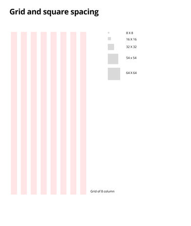
This is the style guide based on the finalised designs.
Based on the brief, I believe I created a successful sign up screen as part of the Daily UXUI challenge.
.jpg)
Next steps
.jpg)
Conduct a Usability Test on a certain group of people for key insights to further develop the prototype (A/B testing)
.jpg)
Assess the colour pallete so the colours can be more accessible according to regulations
.jpg)
Develop the animation elements of the prototype ie developed button states in prototype


